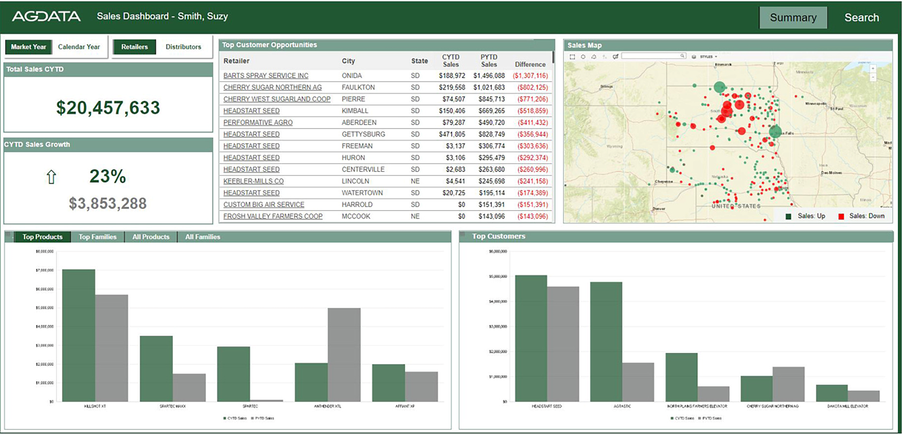
We can all agree that collecting data for a business is critical to making informed decisions, but spending hours trying to manipulate data in an excel spreadsheet can be time-consuming, disorganized and ultimately mind-numbing. Many organizations struggle to see the bigger picture. So, when sales data can be visualized and made relevant for the user, it completely enhances the entire data experience. Bringing critical information to life in an easily consumable format makes it more actionable.
Okay, so how do you get easy-to-understand data?
We interviewed our clients and asked for their feedback– what could we do to make reported data more useful? How do we make data easier to share? Easier for sales teams to take action? Easier for managers to report?
Our clients’ feedback was instrumental in guiding the development of an analytics interface that delivers real-time, job-function-based reporting. This interface highlights opportunities and trends, and identifies key drivers the user can leverage to drive business actions.

Having a platform that visualizes sales data ultimately helps businesses streamline processes, drive revenue-generating behavior, and align decisions with company strategies in a more efficient and effective way.
Click here to learn more about our data management solutions, and how we’re leveraging the power of data in the Agricultural and Animal Health industries.
Subscribe
So you never miss an update!

